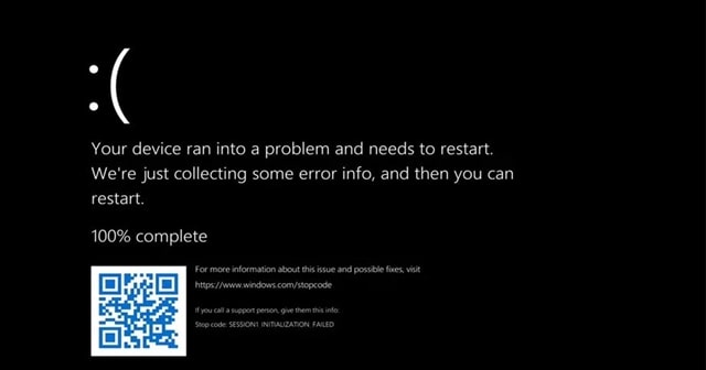
To date, we’ve seen a general BSOD situation on a blue screen with very few details on it. And reports now say that Microsoft changes this to Black, making it a part of a complete UI overhaul in Windows 11.
From Blue to Black in Windows 11
Blue Screen of Death is a notice seen by Windows users on various issues. Microsoft started doing this with the launch of Windows 3.0, which may trigger when something is wrong. And with Windows 8, Microsoft at least started adding few details on what the issue could be – with a QR code, support page URL, and a frowny face to display the demise. There are also Green and Red Screen of Deaths seen by few users on some occasions, like hardware issues or software incompatibilities. But, Blue Screen of Death (BSOD) remained strong and widely seen in most cases. Thus, changing this to Black is significant. Well, Microsoft may justify this with a reason of UI overhaul in Windows 11, which the company and the community see as a wanted refresh.
Thus, changing the regular BSOD screen like the design of other internal elements is fine. But, here’s the problem. There are cases where Windows 10 shows Black Screen of Death, and a Windows 11 user Googling about an issue may clash with this in the future. Though general users don’t see anything much on the BSOD screen, it maintains a huge dump of crash data that can help a system admin or an IT expert to learn about the incident. Turning the color may not be significant to users, but there’s a point. Microsoft wants to distinguish between the BSOD errors in production and preview builds. So if you’re not seeing the Black Screen of Death already, wait for it. Some who are intentionally trying to trigger the BSOD in Windows 11 may still see Blue Screen of Death unless you change a registry key that triggers the black color.

